L+A+B HEALTH CHOCOLATE
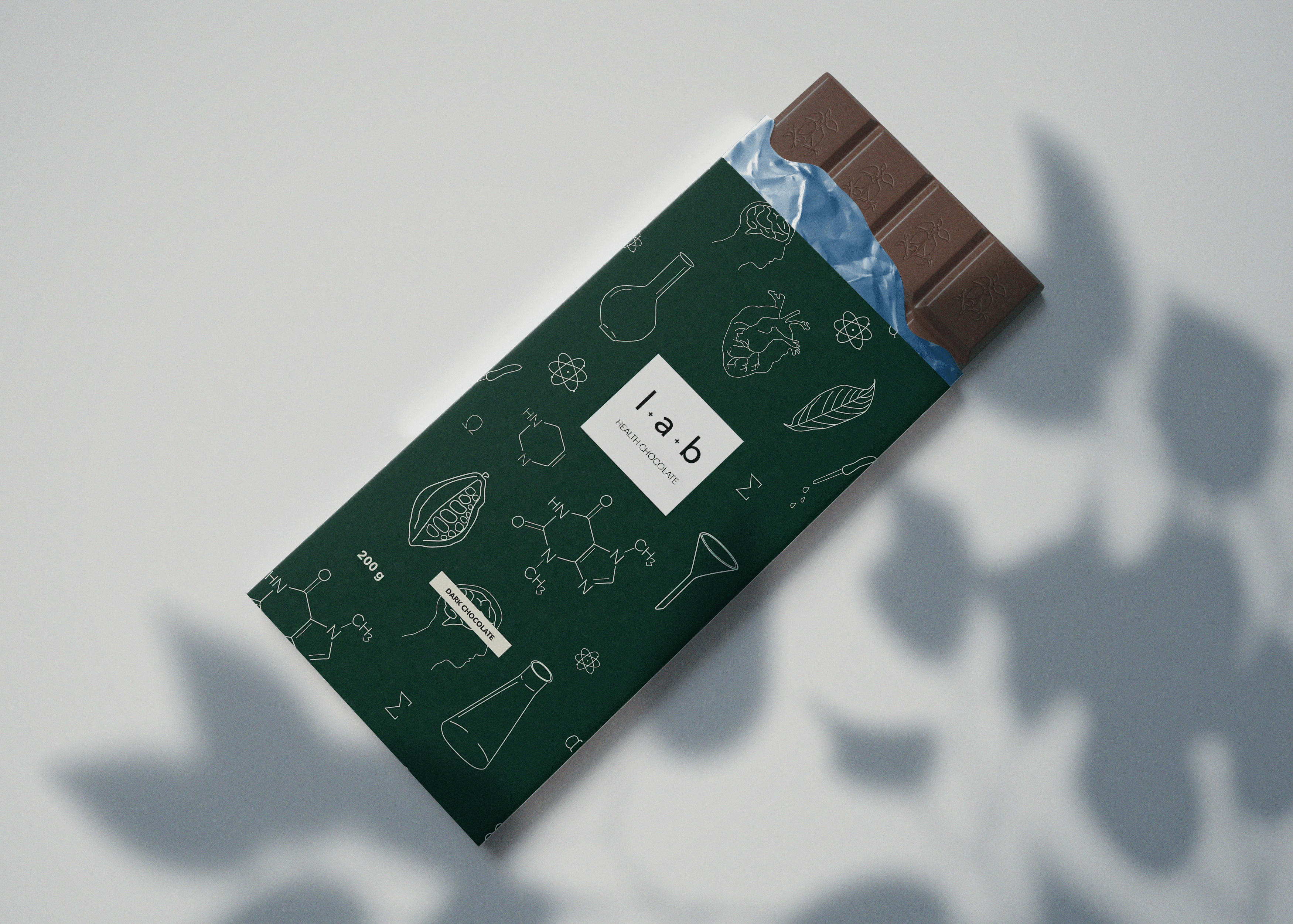
LAB Health Chocolate focuses on balancing indulgence with well-being. This project aimed to develop a brand identity that highlights the health benefits of chocolate without appearing medicinal. The packaging was designed to feel warm and inviting, incorporating subtle health-inspired illustrations. The outcome is a visual identity that allows consumers to enjoy a tasty treat while feeling positive about their choice, demonstrating that health and pleasure can coexist in every bite.
Challenge
The challenge in this project was to balance the emphasis on health benefits with a packaging design that still felt indulgent and inviting. The goal was to avoid a clinical look while showcasing the wholesome qualities of the chocolate.
Solution
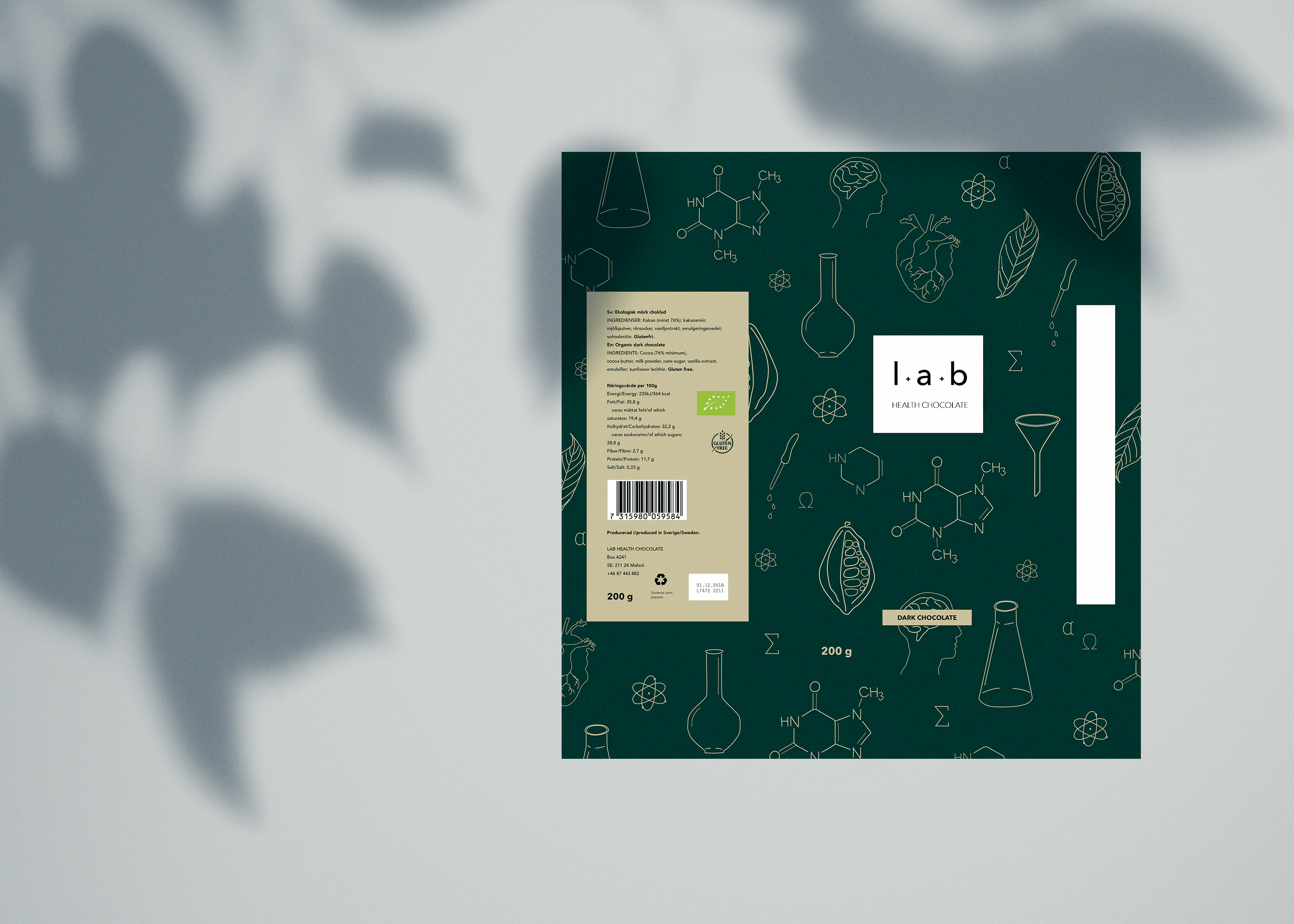
Through subtle health-inspired illustrations and a sleek design, the packaging and brand name successfully conveyed both the product's beneficial ingredients and its sense of indulgence, offering a treat that consumers could enjoy with a clear conscience.
Result
The goal of this project was to craft a visual identity that not only makes consumers crave l+a+b Health Chocolate but also reassures them of its health benefits. I aimed to showcase it's nutritional properties through carefully designed illustrations, highlighting its beneficial content and effects while maintaining an enticing and appealing aesthetic. The overall aesthetic is both inviting and informative, ensuring that consumers are drawn to the product while also understanding its health benefits.
